To explore the Dallas Crime data more yourself, check out my Dallas Crime Explorer Shiny app here.
The code behind this blog post is on GitHub here.
First, let’s calculate the Crime Rates:
PI[,Date := as.Date(substr(date1,1,10))]

PI <- PI[Date >= as.Date("2014-06-01"),]
setorder(PI,Date)

PI[,MonthDate := as.Date(paste0(format(Date,"%Y-%m"),"-01"))]


PI[grepl("MURDER",offincident) | grepl("HOMICIDE",offincident) | grepl("MURDER",ucr_offense) |
     grepl("HOMICIDE",nibrs_crime_category) | grepl("MURDER",nibrs_crime),
   NumMurdersPerMonth := .N,by = MonthDate]

PI[,NumMurdersPerMonth := mean(NumMurdersPerMonth,na.rm = TRUE),by = MonthDate]

PI[grepl("SUBSTANCE",offincident) | grepl("MARIJUANA",offincident) | grepl("DRUG",offincident) |
       grepl("INHALANT PARAPHERNALIA",offincident) | grepl("POSS CONT SUB PEN GRP,",offincident),
   NumDrugsPerMonth := .N,by = MonthDate]

PI[,NumDrugsPerMonth := mean(NumDrugsPerMonth,na.rm = TRUE),by = MonthDate]


PI[grepl("KIDNAP",offincident),NumKidnapPerMonth := .N,by = MonthDate]

PI[,NumKidnapPerMonth := mean(NumKidnapPerMonth,na.rm = TRUE),by = MonthDate]


PI[grepl("ACCIDENT",offincident),NumAccidentsPerMonth := .N,by = MonthDate]

PI[,NumAccidentsPerMonth := mean(NumAccidentsPerMonth,na.rm = TRUE),by = MonthDate]


PI[grepl("ASSAULT",offincident),NumAssaultsPerMonth := .N,by = MonthDate]

PI[,NumAssaultsPerMonth := mean(NumAssaultsPerMonth,na.rm = TRUE),by = MonthDate]


PI[grepl("THEFT",offincident),NumTheftsPerMonth := .N,by = MonthDate]

PI[,NumTheftsPerMonth := mean(NumTheftsPerMonth,na.rm = TRUE),by = MonthDate]
Pivot in preparation to plot:
combined <- PI[,head(.SD,1),
               .SDcols = c("NumMurdersPerMonth","NumAssaultsPerMonth","NumKidnapPerMonth",
                           "NumTheftsPerMonth","NumAccidentsPerMonth","NumDrugsPerMonth"),
               by = MonthDate]

# Remove falsely low month aggregated values since the month is not yet complete.
combined <- combined[MonthDate < as.Date("2021-01-01")]

combined_xts <- as.xts.data.table(combined) # Setup for dyplot

combined <- melt(combined,
                 measure.vars = c("NumMurdersPerMonth","NumAssaultsPerMonth","NumTheftsPerMonth",
                                  "NumAccidentsPerMonth","NumDrugsPerMonth","NumKidnapPerMonth"),
             id.vars = c("MonthDate"))

combined[variable == "NumMurdersPerMonth",variable := "# Murders Per Month"]
combined[variable == "NumAssaultsPerMonth",variable := "# Assaults Per Month"]
combined[variable == "NumTheftsPerMonth",variable := "# Thefts Per Month"]
combined[variable == "NumAccidentsPerMonth",variable := "# Vehicle Accidents Per Month"]
combined[variable == "NumDrugsPerMonth",variable := "# Drug Incidents Per Month"]
combined[variable == "NumKidnapPerMonth",variable := "# Kidnapping Incidents Per Month"]

setnames(combined,old = names(combined),new = c("Date","Crime","# Per Month"))
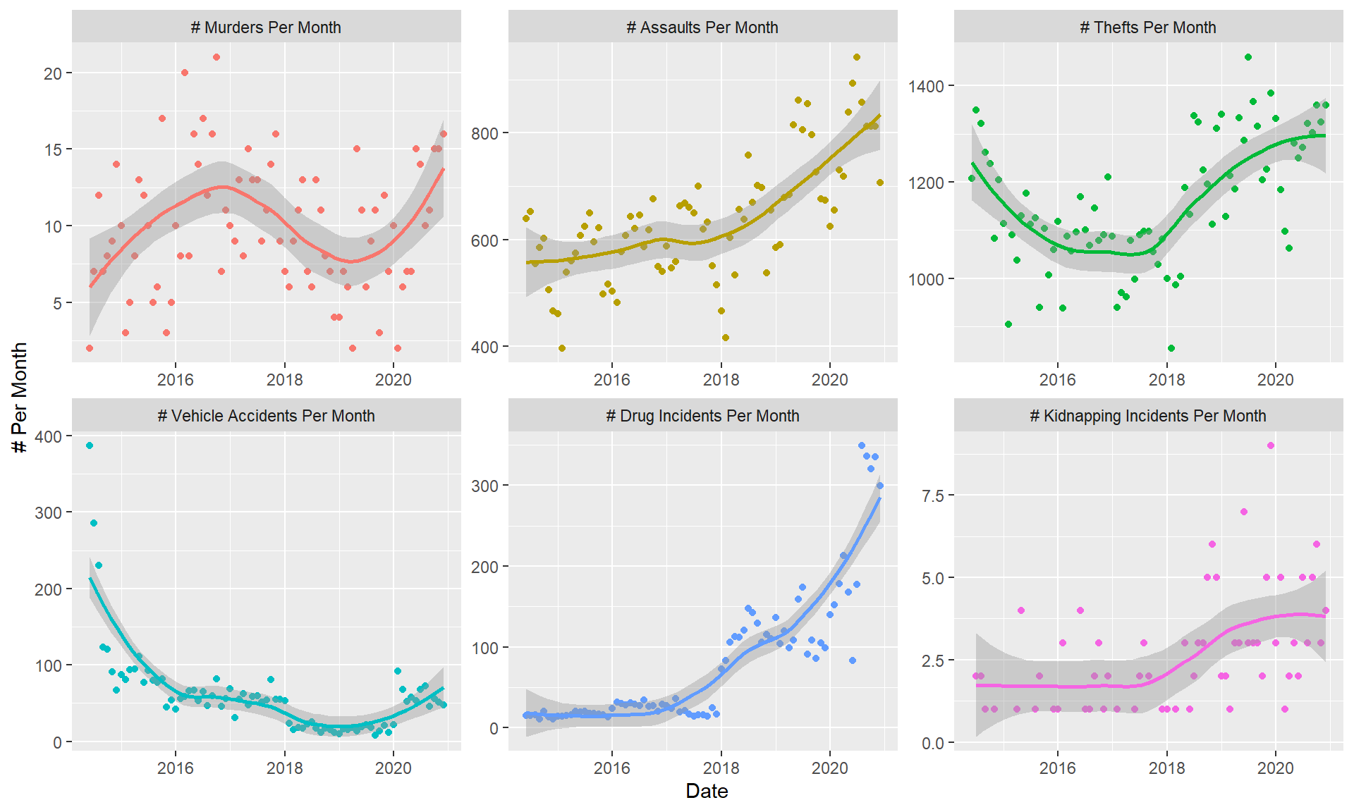
Now finally plot the data:
ggplot(combined,aes(x = Date)) + geom_point(aes(y = `# Per Month`,color = Crime),na.rm = TRUE) +
  geom_smooth(aes(y = `# Per Month`,color = Crime),method = "loess",formula = y ~ x,n = 50,na.rm = TRUE) +
  facet_wrap(~Crime,scales = "free") + theme(legend.position = "none")
Wow. Looks like crime across the board is trending up.
The interactive Dygraph, using the Dygraph package.